Best Practices for Painting in Warm Weather

When the temperature rises, taking on an outdoor painting project can be a double-edged sword. While warm weather is often ideal for your paint to dry, too much heat can lead to subpar finishes and uncomfortable working conditions. Fear not, for we’ve gathered the best practices to ensure your warm weather painting is a breeze, not a sweat fest.
Timing Is Everything
Get a head start on the day by tackling your painting tasks early in the morning or late in the afternoon. These times offer cooler temperatures, less intense sunlight, and consequently, better conditions for both your paint and your comfort. It also aligns with the natural behavior of paint — which doesn’t react well to extreme heat.
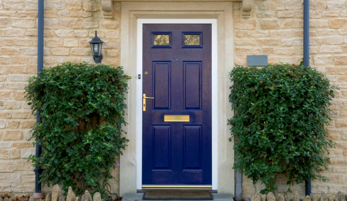
Choose the Right Paint
Not all paints are created equal, especially when it comes to temperature tolerance. Investing in paint formulations that cater to warm weather conditions can affect not just the application but the longevity of your paint job.
Here are some recommendations for exterior paint:
- Sherwin-Williams Latitude Exterior Paint: Formulated with Heat Resistant Technology, this paint is designed to withstand extreme summer temperatures and resist blistering, peeling, and fading.
- Benjamin Moore Aura Exterior Paint: This low-temp exterior paint can be applied in weather as low as 40°F (4°C) without affecting the quality of the finish.
- Sherwin-Williams Duration Exterior Paint: This paint is specially formulated to resist mildew growth, making it an ideal choice for humid climates.
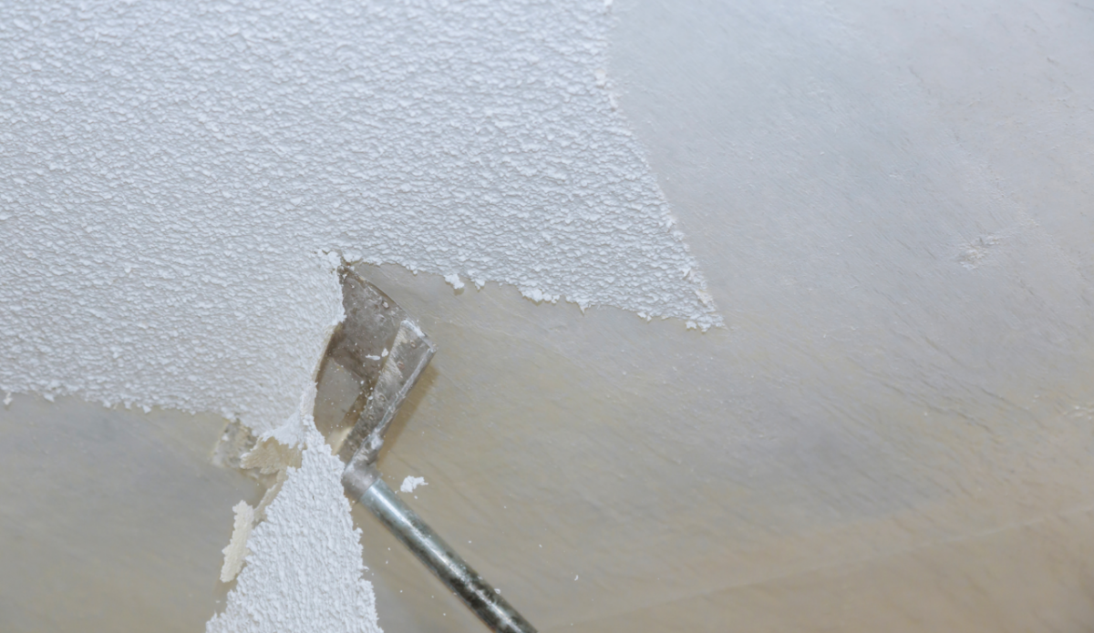
Prep and Prime
Proper surface preparation is crucial for any successful painting project, but it’s especially important in warm weather. The heat can cause paint to dry too quickly, leading to uneven surfaces and poor adhesion. To combat this, thorough cleaning and priming are essential.
Here are some tips for prepping and priming in warm weather:
- Clean the surface thoroughly to remove any dirt, debris, and previous paint.
- Sand the surface lightly to create a smooth base for the paint.
- Use a high-quality primer that is specifically designed for your type of surface and paint choice.
Protect Your Paint Cans
Direct sunlight is not only your adversary during the application process but also when it comes to storage. Keep your paint cans cool and out of the sun to maintain the proper consistency, making sure your application is even and uninterrupted.
Stay Cool and Hydrated
Never underestimate the power of hydration and scheduled breaks — they’re your shield against heat exhaustion. Regularly retreat to the shade to cool down. Take this opportunity to inspect your work and ensure quality.
Regulate Your Work Environment
When it comes to outdoor painting, external factors are often out of your control. However, you can manipulate some variables to make the experience more pleasant and guarantee a flawless paint job:
Outdoor Painting
- Surface Temperature: Paint is temperature-sensitive, therefore avoid applying it on surfaces that are too hot. If the exterior is too hot to touch, don’t paint!
- Wind: Wind can dry paint too quickly, resulting in brush marks and an uneven finish. If it’s too windy, consider postponing your project.
- Humidity: High humidity can cause the paint to take longer to dry and lead to blistering or mildew growth. Avoid painting when the humidity is above 80%.
Indoor Painting
- Air Conditioning: If possible, turn on the air conditioning to keep the room at a comfortable temperature for you and your paint.
- Open Windows and Doors: Good ventilation is crucial when painting indoors. Open windows and doors to allow fresh air to circulate and help with drying.
- Use Fans: Place fans strategically to help with air circulation and keep the
Plan and Stage Your Project
Stages are more than just a method; they’re your strategy in warm weather. Allowing for drying time between coats is critical, as heat can make drying times unpredictable. Work systematically to ensure a flawless finish.
Stay Shaded
When possible, work in a shaded area to avoid direct sunlight. Not only will this keep you cooler, but it also prevents the paint from drying too quickly and leading to brush marks.
Conclusion
Summer brings vibrancy, energy, and the perfect backdrop for revamping exteriors with a fresh coat of paint. By following these best practices for painting in warm weather, you’ll dodge the heat-related pitfalls and relish in the satisfaction of a job well done. So, slather on that sunscreen, grab your brush, and transform your space with color — minus the meltdown.
Remember, it’s not just about painting; it’s about painting smart. Stay cool, stay creative, and above everything, stay safe under the sun.
Hiring the Cova Team
If tackling a painting project in the warm weather feels daunting, consider hiring the Cova Team. Our experts are equipped with the necessary skills, techniques, and insights to manage both indoor and outdoor painting projects, ensuring optimal outcomes regardless of the temperature. With a keen understanding of how heat affects paint application and drying time, our team not only guarantees a high-quality finish but also provides a hassle-free experience, allowing you to enjoy the transformation of your space without the stress.
Trust the Cova Team to bring your vision to life, seamlessly blending expertise with the unique challenges of warm weather painting. Get a free, no obligation consultation.