Wood trim can elevate the aesthetic appeal of any home, adding a touch of elegance and sophistication to the overall design. Maintaining your wood trim not only enhances the beauty of your living space but also increases your property value. If you’re thinking about giving your wood trim a fresh coat of paint, you’re in the right place. In this comprehensive guide, we’ll walk you through everything you need to know to achieve a professional and durable finish.
Why Well-Maintained Wood Trim Matters
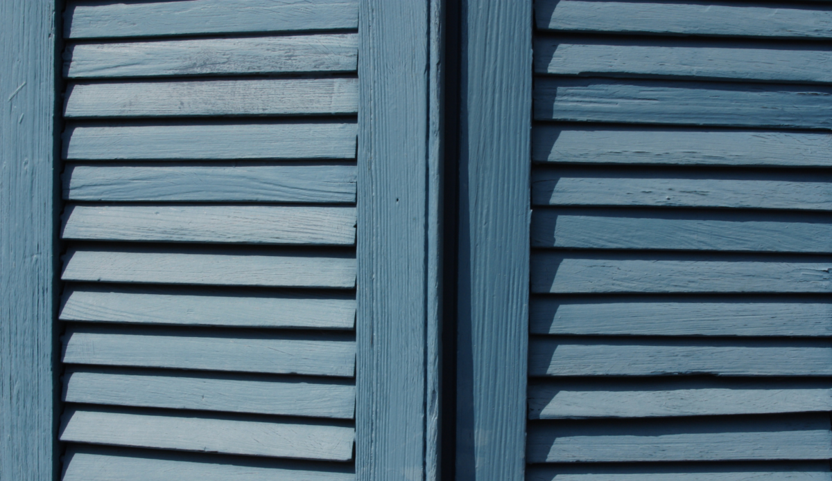
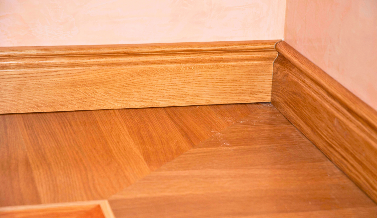
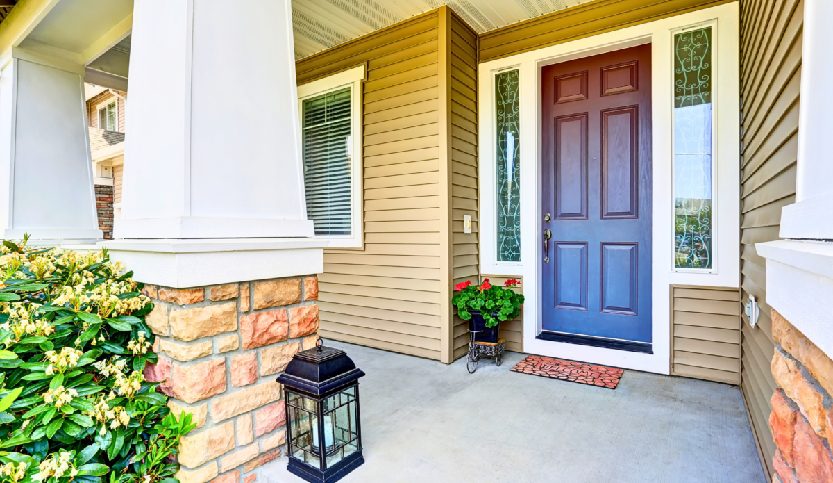
Wood trim plays a crucial role in defining the character and style of your home. It frames your doors and windows, outlines your walls, and adds a finishing touch to your interior design. However, over time, wood trim can become worn, chipped, or discolored, detracting from your home’s overall appearance.
Maintaining your wood trim is essential for several reasons. First, it protects the wood from damage caused by moisture, insects, and everyday wear and tear. Second, a well-maintained trim enhances the visual appeal of your home, making it more inviting and stylish. Lastly, keeping your wood trim in top condition can increase the value of your property, making it a worthwhile investment.
Tools and Materials You’ll Need
Before you start painting your wood trim, gather all the necessary tools and materials to ensure a smooth and efficient process. Here’s a list of essentials:
- Paint and Primer: Opt for eco-friendly and long-lasting paints. Sherwin-Williams offers excellent options like their Exterior Oil-Based Wood Primer and White Pigmented Shellac Primer.
- Sandpaper: Various grits (80, 120, 220) for sanding the wood trim.
- Cleaning Supplies: Mild detergent, water, and a sponge or cloth for cleaning the trim.
- Painter’s Tape: To protect adjacent surfaces from paint splatters.
- Drop Cloths: To cover floors and furniture.
- Brushes and Rollers: High-quality brushes and rollers for a smooth application.
- Caulk and Caulking Gun: For filling gaps and cracks in the trim.
Using the right tools and materials ensures that you achieve a professional finish that lasts for years.
Preparing Wood Trim for Painting
Preparation is key to a successful painting project. Follow these steps to prepare your wood trim for painting:
Cleaning the Trim
Start by cleaning the wood trim to remove any dirt, dust, or grease. Use a mild detergent mixed with water and a sponge or cloth to wipe down the trim. Rinse with clean water and allow it to dry completely.
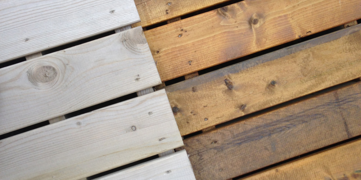
Sanding the Surface
Sanding is essential for creating a smooth surface for the paint to adhere to. Begin with coarse-grit sandpaper (80 grit) to remove any old paint or rough spots. Follow up with medium-grit sandpaper (120 grit) to smooth out the surface further. Finally, use fine-grit sandpaper (220 grit) to achieve a polished finish.
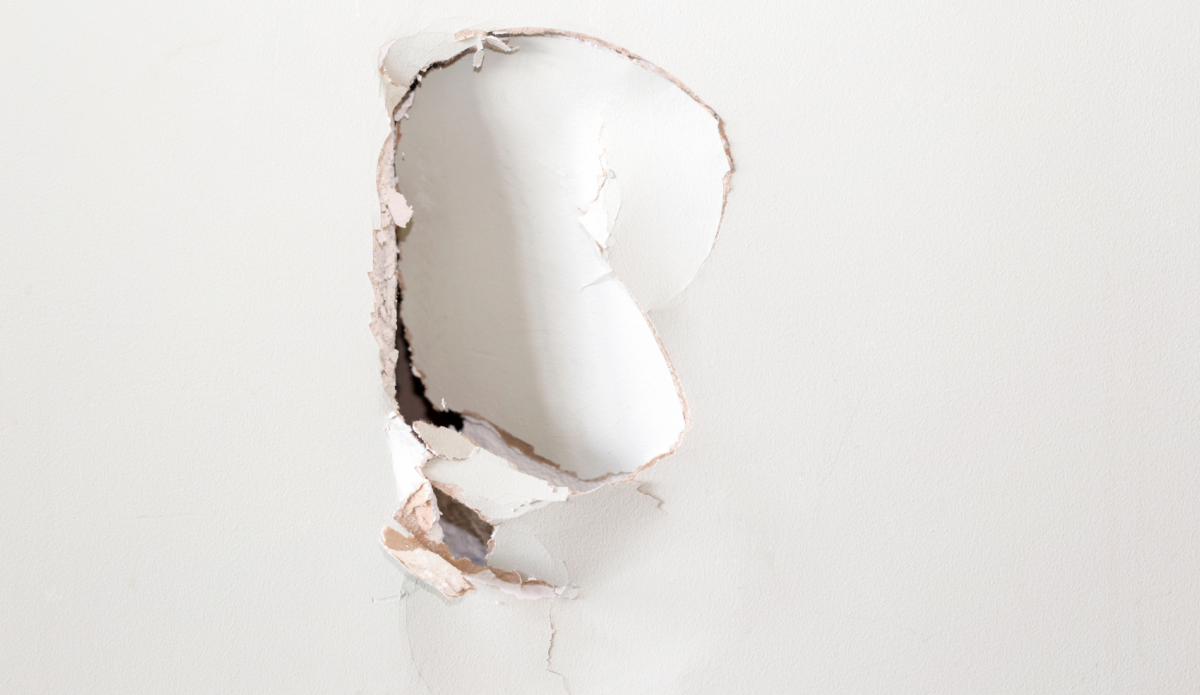
Filling Gaps and Cracks
Inspect the trim for any gaps, cracks, or holes. Use caulk and a caulking gun to fill these imperfections. Smooth out the caulk with a damp finger or a caulk smoothing tool for a seamless finish. Allow the caulk to dry completely before proceeding.
Applying Primer and Paint
Priming the wood trim is crucial for achieving a durable and long-lasting finish. Here’s how to apply primer and paint:
Applying Primer
Choose a high-quality primer suitable for your project. The Oil-Based Wood Primer or Shellac Primer from Sherwin-Williams is an excellent choice for blocking stains and ensuring strong adhesion. Apply a thin, even coat of primer using a brush or roller. Allow the primer to dry according to the manufacturer’s instructions.
Note: White Pigmented Shellac Primer should only be used in the interior of your home.
Sanding Between Coats
Once the primer is dry, lightly sand the surface with fine-grit sandpaper (220 grit) to remove any imperfections and create a smooth base for the paint. Wipe away the sanding dust with a clean, damp cloth.
Painting the Trim
Select a high-quality paint that complements your home’s style. Use a brush or roller to apply the paint in thin, even coats. Start with the edges and corners, then move on to the larger, flat surfaces. Allow each coat to dry completely before applying the next. Two to three coats are typically sufficient for a professional finish.
Choosing the Right Paint Colors and Finishes
The right paint color and finish can make a significant difference in the overall look of your wood trim. Here are some tips for selecting the perfect colors and finishes:
Matching Your Home’s Style
Consider the overall style of your home when choosing paint colors. For a classic look, opt for neutral shades like white, beige, or gray. If you prefer a more contemporary style, bold colors like navy blue, charcoal, or black can make a striking statement.
Testing Paint Samples
Before committing to a color, test a few paint samples on your trim. Observe how the colors look under different lighting conditions and choose the one that best complements your home’s interior.
Selecting the Right Finish
The finish of your paint also plays a crucial role in the final appearance of your trim. Glossy finishes are durable and easy to clean, making them ideal for high-traffic areas. Satin finishes offer a smooth, subtle sheen that works well in most settings. Matte finishes provide a soft, elegant look but may require more maintenance.
Maintaining Your Painted Wood Trim
To keep your painted wood trim looking fresh and beautiful, follow these maintenance tips:
Regular Cleaning
Dust and clean your trim regularly to prevent dirt buildup. Use a soft cloth or a duster to remove dust, and wipe down the trim with a damp cloth and mild detergent as needed.
Touching Up Paint
Inspect your trim periodically for any signs of wear or damage. Touch up any chipped or peeling paint with a small brush to maintain a flawless finish.
Preventing Damage
Take precautions to prevent damage to your trim. Avoid using harsh cleaning chemicals, and be mindful of furniture placement to prevent scratches and dents.
Final Thoughts
Painting your wood trim can transform the look of your home, adding elegance and value. By following the steps outlined in this guide, you can achieve a professional, durable finish that enhances your living space.
Hiring the Cova Team
We specialize in transforming and painting wood trim with precision and expertise. We provide expert consultations, meticulous preparation, and use premium materials to guarantee exceptional results. Our skilled painters deliver seamless finishes, and they provide maintenance guidance to keep your trim looking fresh. Personalized service ensures your vision is met and exceeded. Contact Cova for a professional transformation of your wood trim.